The Lost Art of Cover Art: and my top 10 favourite record covers
I consider myself fortunate to have grown up in the first era of the 33 and a 1/3 rpm vinyl record, having been a music loving and buying teenager for most of the 70’s and then into the 80’s. Vinyl offered a number of experiences that were undoubtedly diminished for the CD era listener and have been largely obliterated since streaming became the dominant medium for music delivery. The full album listen - start to end with a moments respite to turn over the record - was de rigueur for all of us ‘serious’ practitioners. While the pop fangirls in my years at high school wore out the grooves on the one, two or three hit songs per album (they would have loved streaming - just click on repeat), ours was a fully immersive experience, as we delved deeper into the artistry, musicality, poetry and sensory escapism that the long playing record evoked. This was as true for a Dark Side of the Moon (Pink Floyd) or Foxtrot (Genesis) as it was a little later for Rattus Norvegicus (The Stranglers) or Armed Forces (Elvis Costello). We were clearly a superior life form when it came to the consumption and appreciation of rock music and wore this flawed belief as a badge of honour.
Heightening and enhancing the audio experience was the cover art - a minimum of 288 square inches (plus inserts) of imagery, photographs, lyrics, information, credits, acknowledgments, hidden messages and more. The gatefold cover - so popular in the indulgent 70’s - offered even more. It was clearly and cleverly designed to draw you deeper and deeper into to the mysterious world of both the artist and their music, listen after listen, until its scuffed and worn exterior was retired in favour of other shiny new objects. I revelled in the small details, like individual musician credits for each track or, as a keyboard player, the breakdown of the actual make and model of the instruments used on each song. The CD era saw these masterpieces shrunk to less than a quarter of the size, and even multi page booklets were no compensation for this belittling of the artform. Just as they had expanded and evolved through the 50’s and 60’s so, little by little, bit by bit, the offerings became more basic, less visually exciting, less engaging. Then streaming arrived, and now you mostly just get an image of the artists face on your screen, which I personally found was always the least interesting style of cover in the first place.
The Designers
Album cover art became so influential in the 70’s that several artists became almost as famous as the musicians they designed for. Roger Dean was designing furniture when a client, Ronnie Scott’s Management Company, commissioned a cover on the back of some sketches he showed them in 1968. In 1971 he convinced CBS to give him the cover of Osibisa’s self titled album and the rest is history. Not long after he designed the Virgin logo for Richard Branson and then came the call to do his first album for Yes, in this case Fragile. By the end of that decade he had provided his immediately recognisable, sci-fi based paintings for a slew of Yes records as well as Uriah Heep (Demons and Wizards and The Magicians Birthday), Greenslade (Greenslade and Bedside Manners are Extra), Gentle Giant (Octopus) and many more. Over the ensuing decades almost every solo and spin off project from Yes would also employ his services and he also ventured into set design for their tours.
The London based design team of Storm Thorgerson, Aubrey Powell and Peter Christopherson were better known as Hipgnosis and their work is immortalised in some of the biggest selling albums of all time, including Pink Floyds Dark Side of the Moon (and several others of theirs), alongside commissions for Def Leppard, T-Rex, Black Sabbath, 10cc, Led Zeppelin, ACDC, Paul McCartney, Genesis, Yes, Peter Gabriel, ELO and many more. Being college mates with Pink Floyd certainly helped kick start their career, but the work speaks for itself, with some of the most absorbing and distinctive covers of the era.
Many well known visual artists also ventured into the space. Andy Warhol’s work famously adorns the cover of the Velvet Underground and Nico album (the banana album) and also features on the Rolling Stones Sticky Fingers. ELP’s classic prog opus Brain Salad Surgery features a work by H.R. Giger, part of which was a piece the artist had already completed, unwittingly inspired by the bands music, with the remainder of the cover package commissioned by the band, after meeting him in Switzerland. A colourised reproduction of M.C. Escher’s lithograph ‘Reptiles’ adorns the cover of Mott The Hoople’s self titled debut. Escher had declined a commission for The Rolling Stones Let It Bleed album earlier that same year (1969). Famed music biz photographer Mick Rock also picked up several commissions, particularly with Steve Harley (Cockney Rebel).
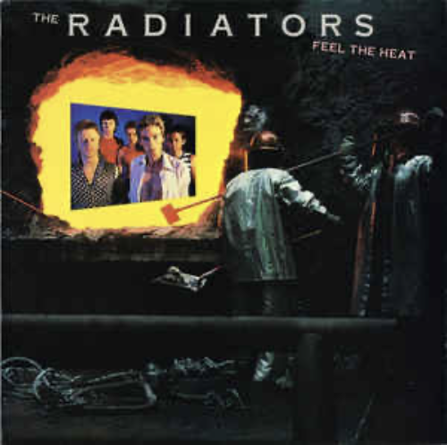
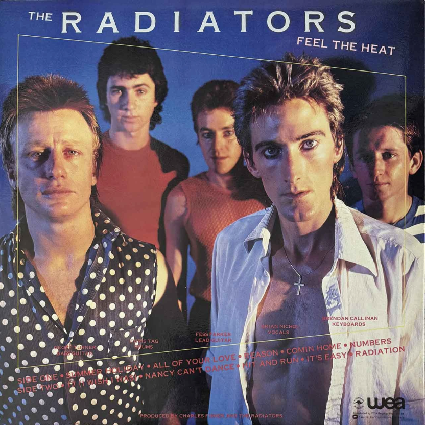
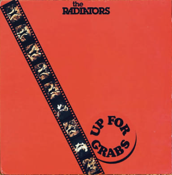
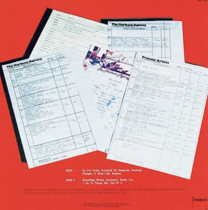
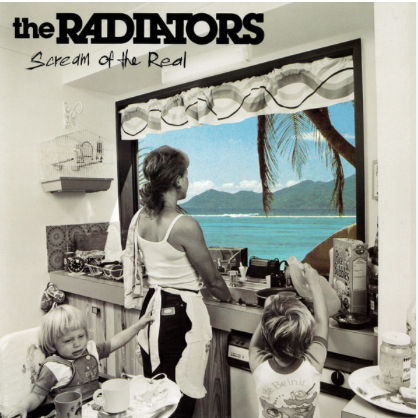
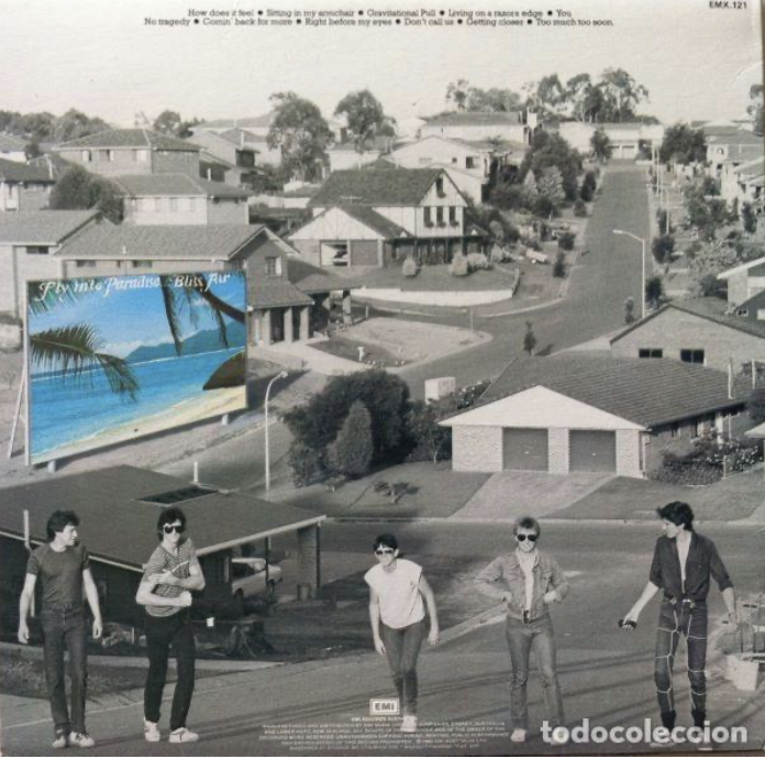
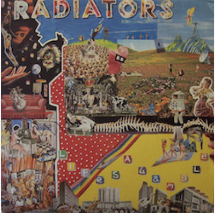
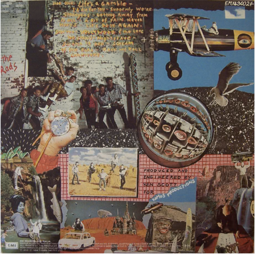
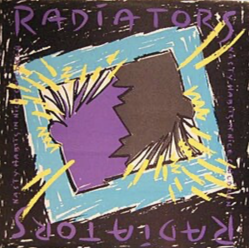
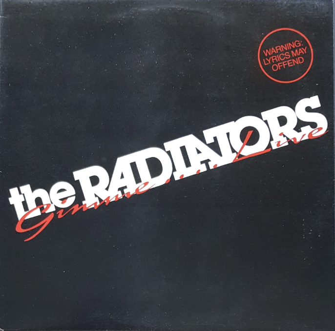
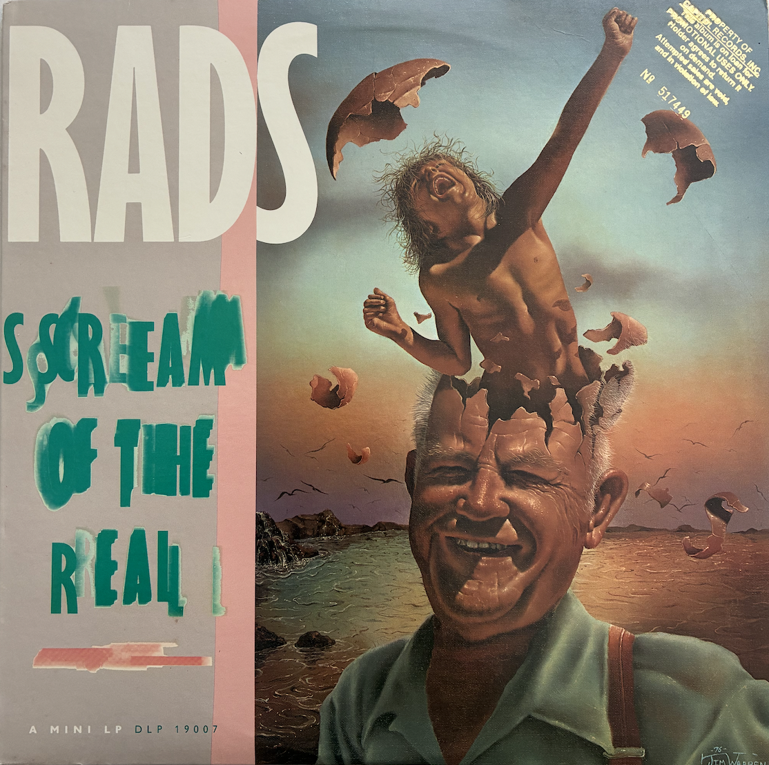
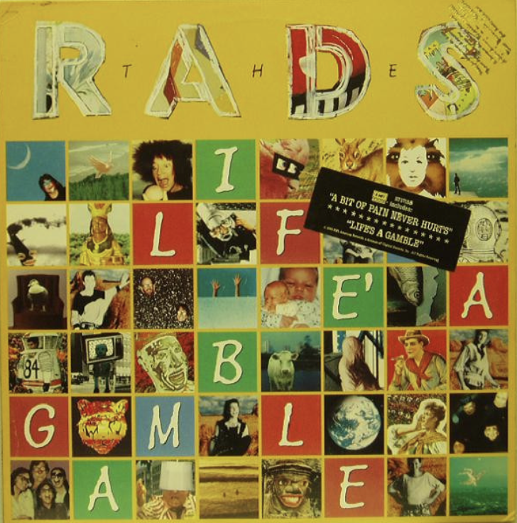
Occasionally musicians would contribute to the creative process of their cover artwork and design. This was true for John Lennon (Mindgames), Brian Eno (Taking Tiger Mountain), Carlos Santana (Borboletta) and Bryan Ferry (Roxy Music - For Your Pleasure). My assumption, or more accurately my educated guess, is that most artists like to have some sort of input or final say over the cover art for the record they’ve invested so much time, passion and energy into. From my own perspective, the experience for each album was quite different. For our first album, Feel The Heat, my recollection is that we worked with the labels (WEA) designer on the broad concept but the finished version was pretty much delivered as a fait accompli, even though it didn't quite match what we had imagined. As label newbies we ultimately didn't have a lot of clout to demand last minute changes. By album two, Up For Grabs, we had moved to a smaller label (Powderworks), and that cover was constrained by both time and budget. Due to its simplicity and the abstract nature of the images however, it has aged much better than the first one. By album three - Scream of the Real - we were with EMI and had assumed creative control. The concept was all ours and we worked closely with the photographer and labels designers to bring it to life. I’m still proud of that cover, in that it clearly conveyed the message we were pushing. For album four - Life’s A Gamble - we had already worked with director Mike Heffernan on the video clip for the title track. He proposed an album art concept that was ambitious, and very much of its time. His team took control of everything from wardrobe and hair to the graphic design and other content. I particularly like the board game concept of the inner sleeve. While the looks and fashion haven’t aged too well, the broader concept and design work still looks great. It’s one of those covers that has a lot of small details to look at and absorb over time, and I’ve always liked those. Next came Nasty Habits, which was very restrained by comparison and, finally (for me anyway), Gimme….Live, which followed the tried and true formula for live albums, with a very simple and direct front cover, colour live shots of each member on back, and an inner sleeve with loads of photos, endless credits and other information. None of them are likely to make anyones ‘best of’ list, but Scream of the Real stands out and has received a lot of positive comment over the years.
Also of interest are the ‘alternate’ covers that were used for our US and German releases, which came out as The Rads. For Scream of the Real, EMI America used a painting by Jim Warren titled ‘Second Childhood’. Jim had won a grammy for his commissioned art on Bob Seger’s Against The Wind album. EMI America also modified and simplified the Life’s a Gamble cover, the final result reminding me a lot of Dragon’s OZambezi artwork.
My Favourite Album Cover Artwork of all time…….
So, fully understanding the division and disagreement that lists can generate, I’m going to name my 10 all time favourite record covers. Note that I said favourite - not greatest, best, most influential or any other label that positions my opinion above that of anybody else. These are just the ones I like, for a variety of reasons. Nothing more than a conversation starter. My choices have little to do with the music they contain, though I suspect it’s still a minor influencing factor, particularly as I’ve drawn these selections exclusively from my own vinyl collection. I’ve excluded box sets - some are spectacular - and greatest hits compilations. I’ll avoid trying to rank them in order and list them alphabetically by the artists name. As usual, the first task was culling a long list of over 20 albums back to 10. Someone had to miss out and honourable mentions need to go to Aladdin Sane - UK Gatefold (David Bowie), Prince and The Revolution (self titled) and Goodbye Yellow Brick Road - US Gatefold (Elton John).
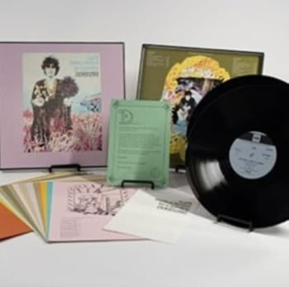
A Gift From a Flower to a Garden - Donovan (1967)
I bought this album from a second hand store in San Diego, for no other reason than the packaging, which really is quite extraordinary. It’s Donovan’s fifth album, released in 1967, a double album which comes as a boxed set. The most amazing part is that it includes a folder containing an illustrated lyric sheet for each song, with drawings by Mick Taylor and Sheena McCall, all printed on quality parchment. When Donovan presented the packaging to label boss Clive Davis he refused to release it unless Donovan personally paid for all of the additional accoutrements. I may or may not have actually listened to the records. It really doesn't matter. The cover art completely stands on its own in this case.
Armed Forces - Elvis Costello and the Attractions - UK Pressing (1979)
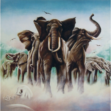
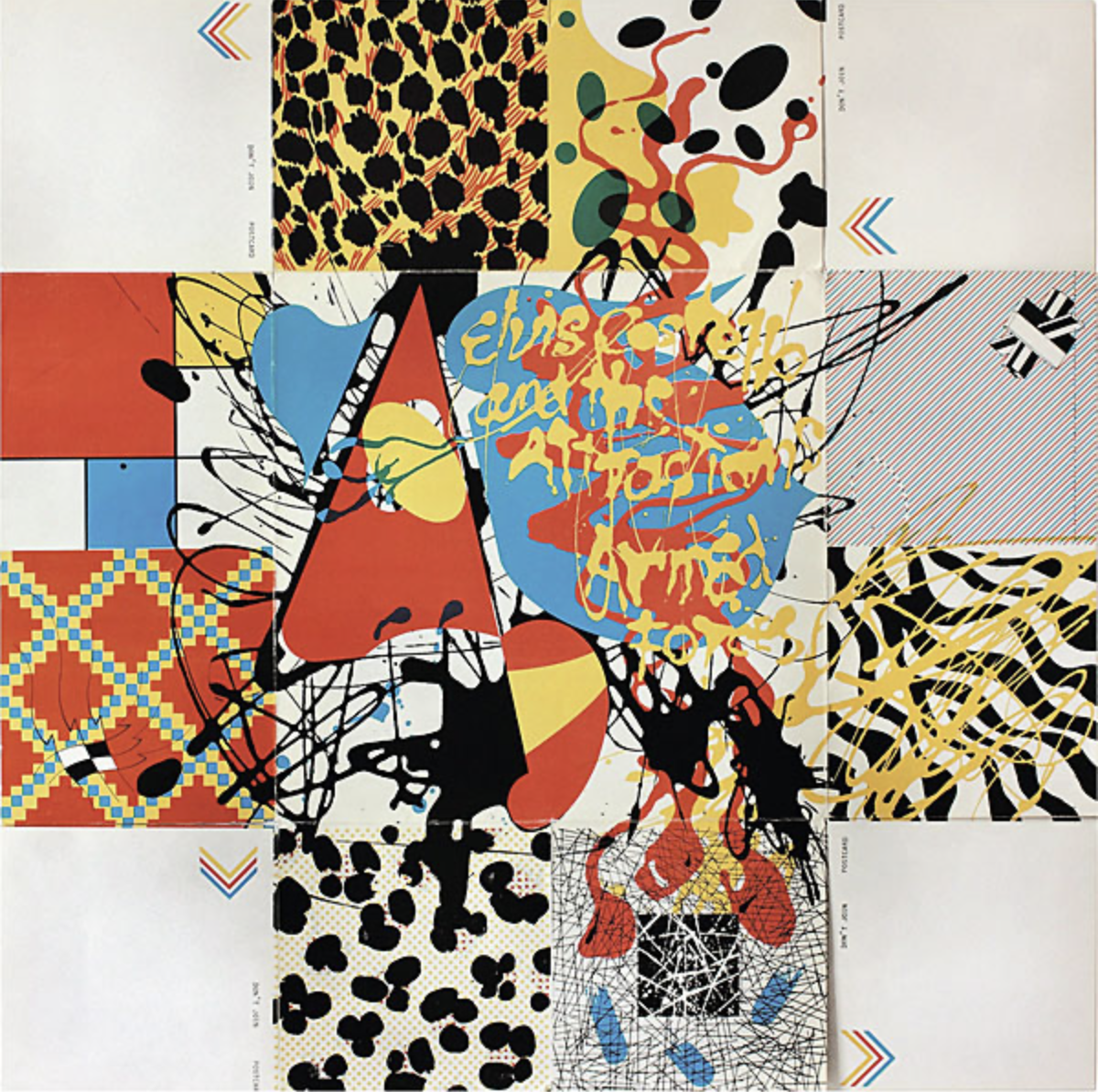
This was Elvis Costello’s third album and the previous two, My Aim is True and This Years Model featured very simple cover art. Seemingly with the success of those two records, the budget for Armed Forces was upgraded, and the UK version featured a fold out back panel, each section containing pop art motifs implying animal and military themes. The inner sleeve continued the pop art theme, with vivid colours and some experimental photography, while the front cover shows a herd of stampeding elephants. The US release swapped this out for the main image on the UK back cover, which included the artist and album titles. Design is credited to both Barney Bubbles (also Hawkwind) and the band themselves. The appeal for me was in breaking away from the standard single sleeve or gatefold format, with the multiple, overlapping folding panels creating a whole new pallet for expression.
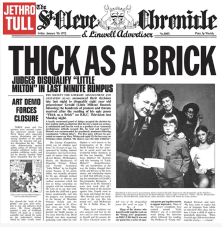
Thick As A Brick - Jethro Tull - US Pressing (1972)
The Australian release version of this album that I owned in the 70’s has the detailed gatefold cover, emulating a UK regional newspaper (The St Cleve Chronicle). It’s full of endless detail, humour and oddity and it kept me enthralled for years. But, while living in America, I found a copy of the US release which actually expands that to a 10 page newspaper liftout, every page loaded full of what I assume are bespoke articles, conjured up just for this release. There’s news, sport, community events, your horoscope, letters to the editor and more. It’s fantastically quirky, providing the perfect compliment to the offbeat music it contains.

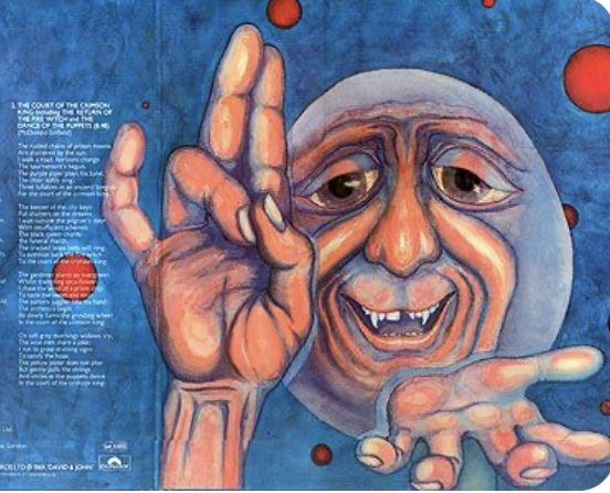
In the Court of the Crimson King - King Crimson (1969)
The magic of this cover is in the two striking paintings that adorn the outer cover and the inner gatefold. Both paintings are by Crimson member Pete Sinfield’s friend Barry Godber, who used his own face as the subject matter. Extraordinarily, Godber died from a heart attack in 1970, aged only 24, just a few months after the albums release. They were his only known paintings. It’s also amazing to reflect that this is their debut album, given that the music still seems so evolved and the cover art shows a high degree of investment from the label, for an unknown band.
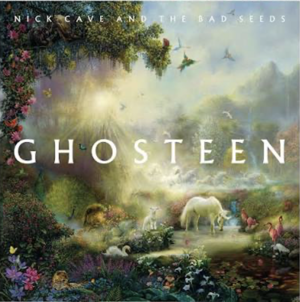
Ghosteen - Nick Cave (2019)
Ghosteen's sleeve was designed by Cave himself, alongside the London based Hingston Studio who he had worked with on prior releases. The front cover art features a segment of The Breath of Life, a 2001 painting by the artist Tom DuBois from his Eden series. It presents religious overtones, with angelic rays lighting a colourful pastoral scene of abundance and life. By contrast, the internal gatefold photo of Cave and Warren Ellis is moody, wind swept and printed in muted tones. The album was written in the wake of the death of Cave’s 15 year old son Arthur. The live film of Cave and Ellis performing the album had a simultaneous, worldwide, one night only cinema release, tragically on the same day as Cave’s oldest son, Jethro, passed away in Melbourne aged 30. Somehow the cover art seems to reflect much of this tragedy and sadness, but also positivity and hope.

I/O - Peter Gabriel (2023)
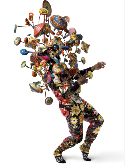
I follow Peter Gabriel directly and had heard most of the songs from the album as he’d been releasing them one at a time for some months prior to the full album launch. A few months later I found the record in the bargain bin at a JB Hifi store in Melbourne. Gabriel strikes me as someone who delivers every project with meticulous care and precision, and this packaging is no exception. It’s a double album in a full gatefold cover. The main photo, by Nadav Kander, is captivating but the real magic is in the internal booklet, which features a bespoke artwork with every track and lyric page, not dissimilar to the Donovan album I mentioned earlier, but with all the advantages of modern digital printing. The artists he collaborated with include Ai Weiwei, Nick Cave (a piece called Soundsuit, pictured above), Barthelemy Toguo, Olafur Eliasson, Annette Messager, Antony Micallef, Henry Hudson, Megan Rooney, Cornelia Parker, Tim Shaw, David Spriggs and David Moreno. The album also feature an Obi strip, a promotional device usually restricted to Japanese releases, in this case featuring Peter’s signature.
Wish You Were Here - Pink Floyd - US Pressing (1975)
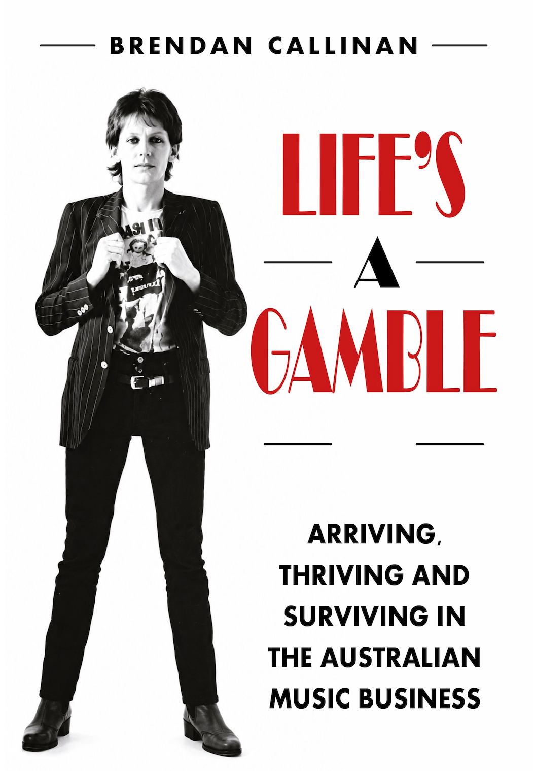
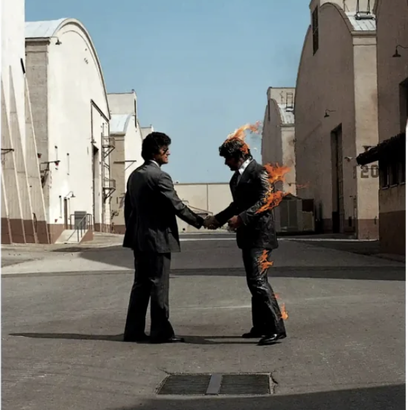
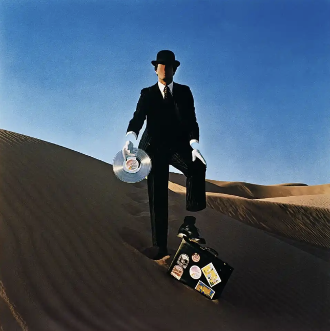
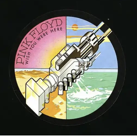
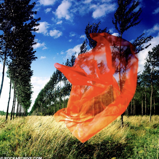
It would be remiss of me not to include at least one Hipgnosis cover, given their impact on the art form. Rather than the ubiquitous Dark Side of the Moon, I’ve gone for its successor, Wish You Were Here, which I also prefer musically, so that may be an influencing factor. The first appeal for me is in the stark white cover, something that appeals to me in what is often a sea of black in the music business. My book, Life’s A Gamble is similarly presented. Queen’s A Night at the Opera is also in that vein. The Wish You Were Here front cover shows two businessmen shaking hands on a Warner Bros film studio backlot, though one of them is on fire. Both were stuntmen employed for the shoot and the burning man did in fact suffer minor burns after the wind changed direction on the fifteenth take, though apparently most of the previous fourteen were pretty good. The rear cover has an image of a faceless salesman, devoid of ankles and wrists - an empty suit. This picks up on a theme from the record that laments the intrusion of the business of music on the band following the stratospheric success of Dark Side of the Moon, particularly the songs Have a Cigar and Welcome To The Machine. The internal photos, by contrast, are of the serene, mirror like Mono Lake, in California. My US printing also has a postcard of this lake included inside the sleeve. Another shows a red veil, seemingly floating on the breeze through a grove of trees, but it also appears to conceal a nude female figure. Photography was by Hipgnosis founder, and long time friend of the band, Aubrey Powell. Contrasting all of this was a futuristic logo that furthered the handshake motif, but this time represented by machine like images. Designed by George Hardie, it would be included on the record label, but also on a sticker attached to the black plastic shrink wrapping which actually concealed the album artwork from the casual record store browser. Pink Floyds US label, Columbia, tried to veto this idea, but the band, with support of their UK label EMI, had a lot of clout now, and pushed it through.

Ogdens Nut Gone Flake - Small Faces (1968)
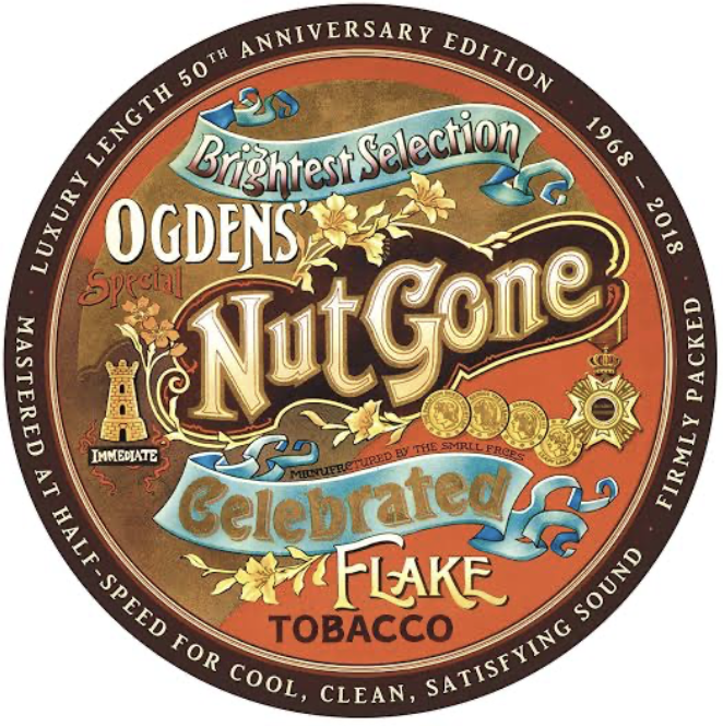
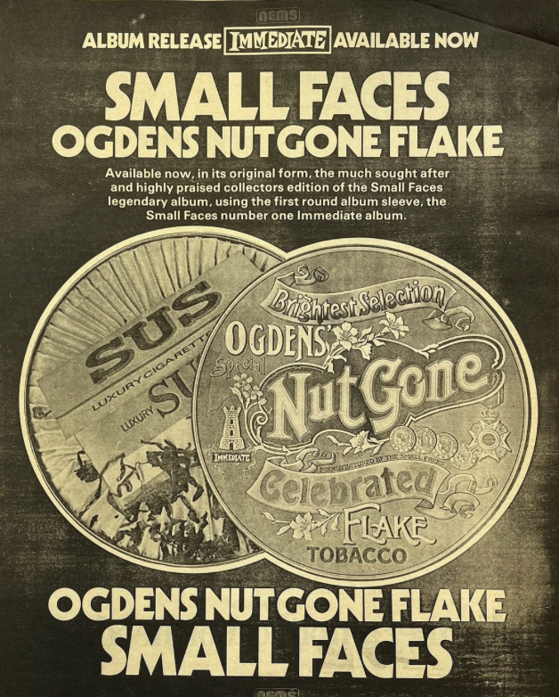
This was a concept album, the third studio record from the seminal British band, and the last with the original lineup. It features two of their classic songs, Afterglow and Lazy Sunday. The album was originally released in a novelty package of a metal replica of a giant circular tobacco tin, inside which was the record and a poster with five connected paper circles with pictures of the band members. This not only proved too expensive, but was spectacularly unsuccessful in practical terms, as the tins tended to roll off of the record store shelves. It was quickly abandoned and followed by a paper/card replica with a gatefold cover, the version that I have. The tin concept was resurrected for the release of the limited edition 3 CD set in 2006. The award-winning artwork for the album was produced by Nick Tweddell and Pete Brown, who were art school friends and former bandmates of Small Faces keyboardist Ian Mclagan. The album cover illustration was by Harry Willock. An interesting side note is that early pressings of XTC’s 1984 album The Big Express, came in a round sleeve as a direct nod to the Small Faces record.
English Settlement - XTC (1982)
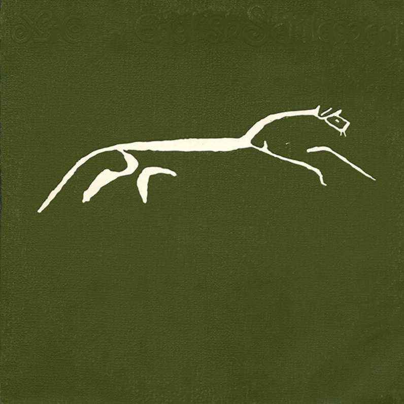
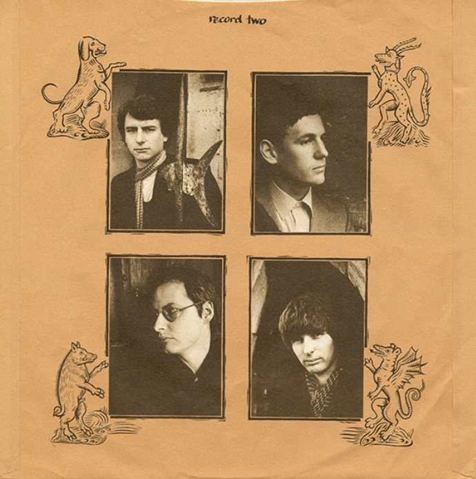
…..and that’s a perfect, though purely alphabetic segue to XTC. The appeal for me with this cover is in its bold simplicity. While there are several different iterations of it, the UK version I have does not include the album title anywhere on the outer sleeve except on the spine in tiny font. The bands name appears on the back. What isn’t obvious from the photos is the texturing of the cardboard, which has an embossed, tactile, almost fabric like feel. It’s a double album but presented in a single sleeve, not a gatefold. The two inner record sleeves contain all of the information - lyrics, credits, photos - embellished with artwork that reinforces the mediaeval feel of the title and design. The band felt that this was their most English sounding work to date and wanted to reflect that in all aspects of the packaging. The front cover image is derived from the Uffington White Horse, a 110 metre long prehistoric hill statue, near the bands home town of Swindon. Apparently their US label (Epic) hated it and suggested that their artists could draw a much better horse, presenting the band with images of mustangs and broncos which were all summarily rejected. And a damn fine record to boot.
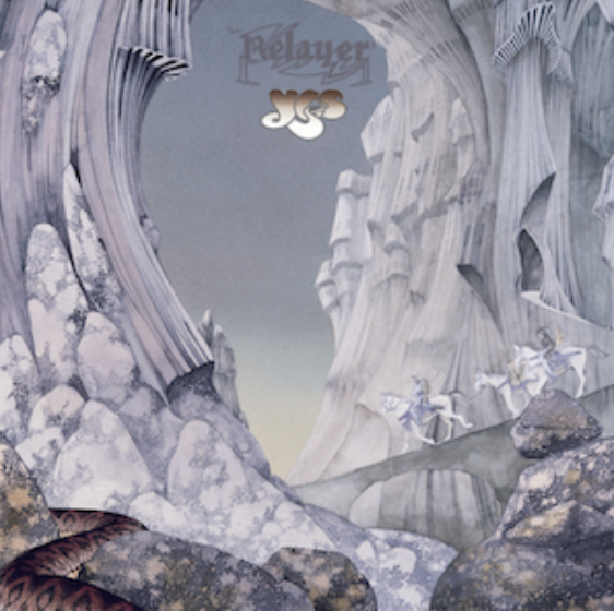
Relayer - Yes (1974)
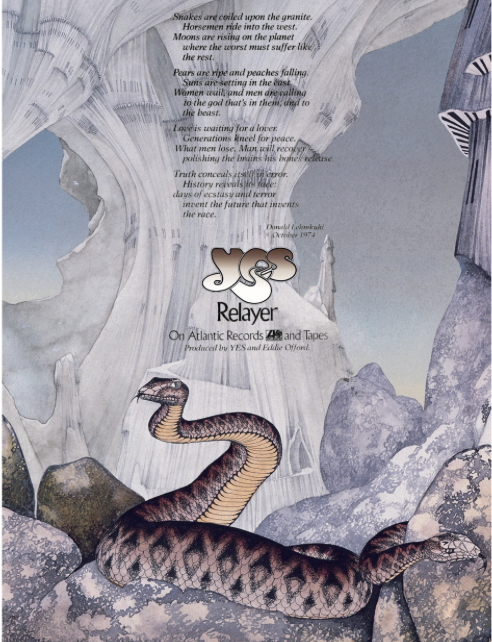
As with Hipgnosis, I was never likely to not include a Roger Dean cover. There are so many to choose from, across many, many bands, not just YES. Despite their similarities - his style is very distinctive - all of his works have their individual qualities. Relayer, for me, is the most striking. The colour palette is reduced to mostly shades of white and grey, and while it possibly lacks some of the minute detail of his more expansive covers, for me the statement is his strongest and conveys something very tangible and clear. Apparently Dean himself agrees with me, naming it as his favourite Yes cover in his 1975 book (which I have). The final painting was inspired by one of his earliest watercolours, dating back to 1966. It’s fairly evident that his work has had a wider impact, clearly influencing the aesthetics of films like Lord of the Rings and others. Those of you who admire his work will no doubt choose different covers as your favourite, but it matters little. His work was very consistent and, despite the obvious similarities, they all somehow seem to capture the mood of the records contained within.
So that, folks, is my list, as of this day in October 2026. Ask me again on another day and it will, most likely, differ, though with a few constants.
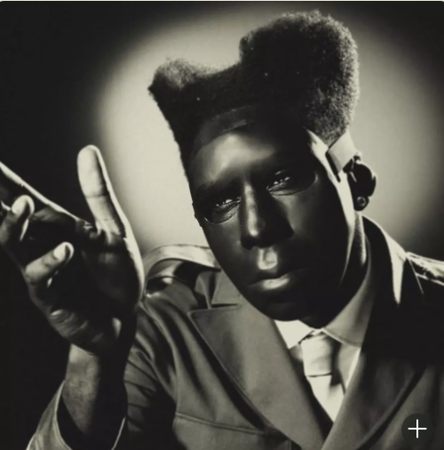
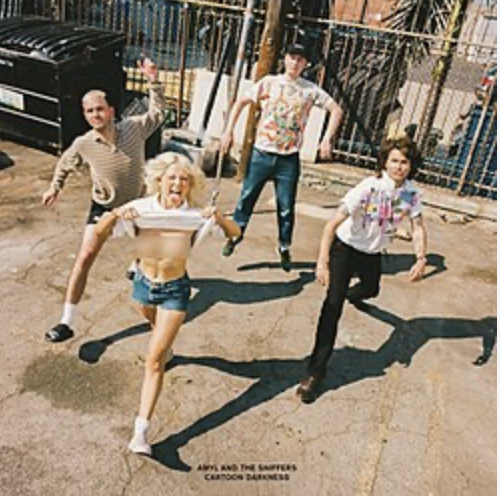
Vinyl sales are now rebounding as music lovers both old and young are re appreciating both the audio experience and the visual feast that is a well designed album cover. With that surge in sales is coming the revival of the artform, so much so that in 2026 the Grammy’s reinstated the Best Album Cover award, for the first time since the mid 70’s. Tyler The Creator took it out for his album Chromakopia (pictured above). Here is Australia, the ARIA’s have continuously acknowledged cover art in their awards, with Amyl and The Sniffers taking out the most recent gong (2025) for Cartoon Darkness (pictured above).
Unlike more expansive ‘best or greatest’ lists, these are just my favourites, from my vinyl record collection. I welcome comment and debate from anyone who is as interested, passionate and opinionated as me on the subject.
Be The Sea - October 2026